

Here's a short opinion piece regarding requests for higher 'visibility'.
For the sake of the argument I'm going to assume most users requesting such features are veterans from previous iterations of quake or the like.
On a quick glance, game engines in the late 90ies / early 2000s had a very distinctive 'blocky' feel to it. Even round shapes appeared to be sloppy bent lines, makeshift solutions.
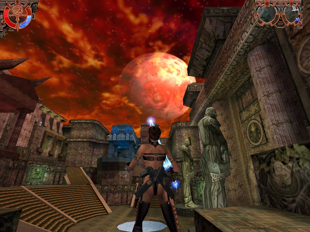
Take a look at Heavy Metal Fakk 2 running on id Tech 3 - the 'Colosseum' doesn't have a very round feel to it. Notice how the statue on the right of the player model is all chopped up and 'blocky'
Visual Cluster
Colors, Staturation
Shapes, Lines, object complexity


Cosmetics, Consistency
Consensus
For the sake of the argument I'm going to assume most users requesting such features are veterans from previous iterations of quake or the like.
On a quick glance, game engines in the late 90ies / early 2000s had a very distinctive 'blocky' feel to it. Even round shapes appeared to be sloppy bent lines, makeshift solutions.
Take a look at Heavy Metal Fakk 2 running on id Tech 3 - the 'Colosseum' doesn't have a very round feel to it. Notice how the statue on the right of the player model is all chopped up and 'blocky'
Visual Cluster
Games that we're passionate about usually have less visual cluster, clean head up displays, minimalistic design and so forth. The year's 2017, while recently more and more video games adpoted clean, intuitive or even invisible HUDs represented in game design, the screens tend to be packed with more content.
Colors, Staturation
Do a quick run down of your favorite game and you can quickly define a palette - quake 1 uses predominantly greyish/brownish scheme, quake 2 uses slightly brighter brownish colors, inching closer to a dark orange. Quake 3 has a lot of red highlights throughout the maps and level esign, player models but retains the greyish-brown scheme to some extent. Now take a quick glance at quake champions - the colors are more vivid, aren't as washed out as previous titles, it's eye candy (to some) and a strain for those that literally lived their lives alongside older quakes.
Shapes, Lines, object complexity
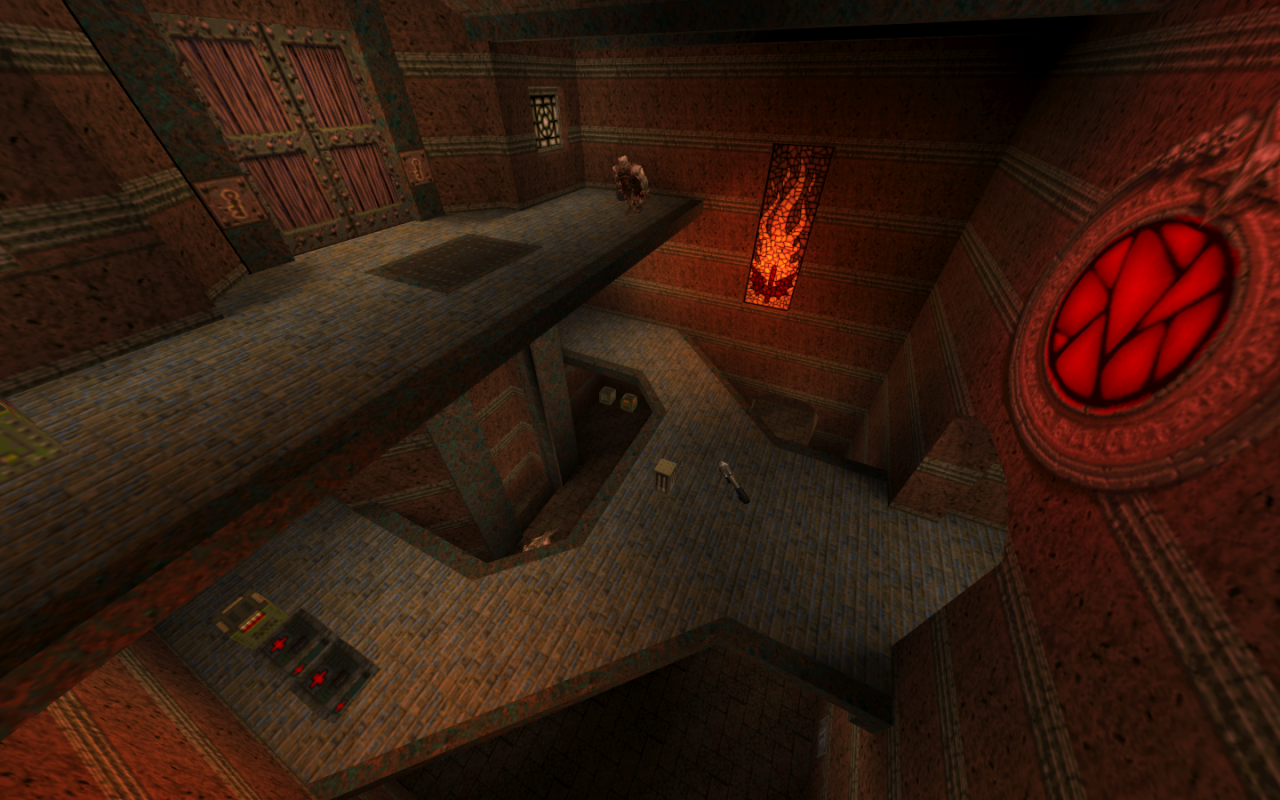
Here's where it gets really interesting. Take a look at two random screenshots from Q3, pay attention to straight lines, level geometry, gun model
Lots of strong lines, clearly defined shapes, not much going in terms of variety - a clean level design that stands the test of time.
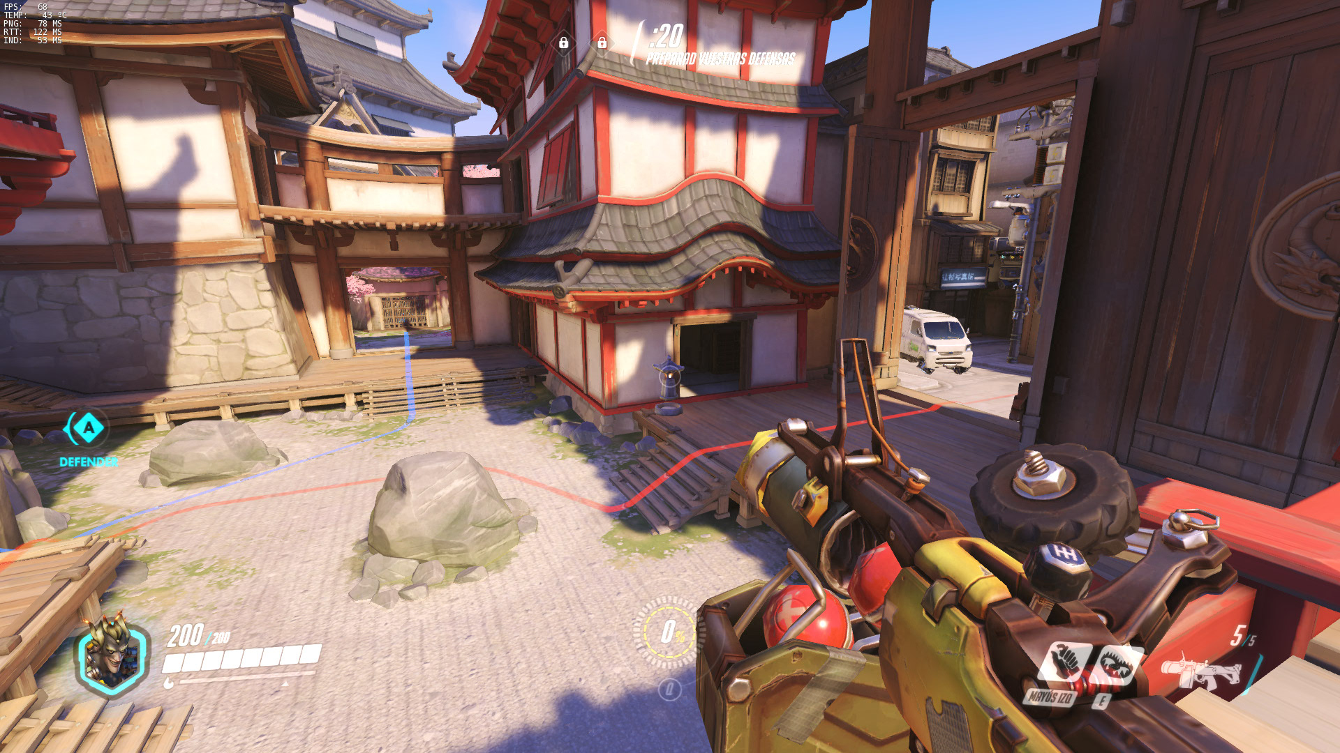
Now on to a screenshot from QC I snatched online -
Quite frankly, the gun model itself has more going on than the entire level from Q3. Plenty of shapes, an obvious lack of straight long lines, inconspicuous edges. In order not to cherry pick I used this image and am convinced that it's hard to come up with screenshots that would go against my theory - the level of fidelity is just light years ahead, attention to details, different technologies and rendering engines used..
Geometry plays a vital role in competitive FPS titles - levels need to be elegantly traversed, allowing for swift, fluid movement and fast paced action. Cramped corners usually remove the integral gameplay which provide compelling combat scenarios, skill based executions, eyecatching air rockets, light gun pins and other buzzwordy glory kills. Q3/Q2 level design simplicity allowed for greater mobility and 'shiny' frags. Map design, item placements etc are another topic though - I'm not too well versed in it.
Cosmetics, Consistency
Adding neon models, bright skins and similar visual aids clashes with the art direction - the screen is already cramped with visual clutter. It won't make the game more relaxing, more pleasing or more visible, it will just look out of place and in some cases even worse.
For the longest time, competitive gaming had a way to force models. Counterstrike had cl_minmodels (*cvar might have changed), UT had .ini settings (PlacedCharacterName= _____ ), quake has cg_forceEnemyModel ' ' - None of these games had 'classes' though, forcing all models as Slash for example would be very confusing if you end up getting blasted by Ranger's Dire Orb. There's also cosmetics that come into play and I'm pretty sure it would cause a downfall for in-game payable items if someone were to just tinker the settings to remove them.
Consensus
What veterans are after is not bright skins but a nostalgia filled expectation for a period where games were less clustered with visuals, effects, particles and were built around 'primitive' engines which favored simple shapes/design, a more robust level geometry and similar remnants of the past.
Edited by Teen Queen at 06:40 CDT, 27 April 2017 - 19380 Hits