ESReality - Where Gaming Meets Reality
  • Site
  • Text
  • Media
  • Games
About | Contact | Guide | Filters
Users | Preferences | Search | FAQ
News | Forums | Columns
Journals | Articles | Polls | Wiki
Files | Galleries | Demos
Events | Coverage | Movies
ESR Shop | Betting Fixtures
Not Logged In | Login | Register
08:51 CDT - 664 users online

ESR Discord Channel
Live Streams
no live streams found
Scheduled Listings
more...
Other QL threads
  • WHAT YEAR IS IT (8)
  • RECOVER DELETED ACCOUNT (0)
  • Awards Display (2)
  • QL surpasses QC player numbers: time to make it free? (11)
  • Banned in HOQ discord server (25)
  • El Risitas meme featuring SyncError and Sponge: Where is it? (3)
  • Team fortress mod in quakelive (0)
  • Is Rapha Asian? (9)
  • Tried QL after some huge break and it feels like crap (32)
  • Just another gameplay idea... (1)
more...
Latest Threads
Latest Comments
  • News QL LAN Stuttgart 2025 (13)
  • Image Rapha playing his group games (127)
  • News QuakeCon 2022 (162)
  • News Frazer "Fraze" Hockley has passed away (54)
  • News Announcing FPS Cup 03 – Quake 3 Defrag Tournament (2)
more...
Latest Forum Threads
  • Q3 Quake3 Remake (51)
  • Q1 Elon Musk says he was among the best Quake players worldwide (123)
  • QL WHAT YEAR IS IT (8)
  • GG Best mouse in 2025 (4)
  • QL RECOVER DELETED ACCOUNT (0)
more...
Latest Journals
  • 2z faye (27) by stpbozin
  • we meat again (1159) by aggnog
  • Quake Live, the greatest esports game ever made? (5) by vr_and_games
  • Why this game sucks to hard? (29) by The_Sh33p
  • Mars died as his temple burned. No new gods of war exist. (57) by ShadyVoltaire
more...
Hot Topics
more...
ESR Virtual Betting
Lamur
E$ 238,131
  • E$ 176,304 Italy omek
  • E$ 129,238 Sweden fazz
  • E$ 61,723 shaftwhores only by [EXE]dann lithz
  • E$ 58,635 Colour: black nsx0r
  • E$ 57,658 United States of America nk121

  • Betting Leaderboard
  • Open Betting Fixtures

New QL thread
Forums > Quake Live Forum
New spec-hud feedback. (39 comments)
( Forum: QL)
Posted by daytripper @ 18:14 CDT, 23 July 2015 - iMsg
7153 Hits
3%

<< prev QL thread || next QL thread >>


<< Comment #1 @ 18:15 CDT, 23 July 2015 >>
(Link, Reply)
By esr daytripper 
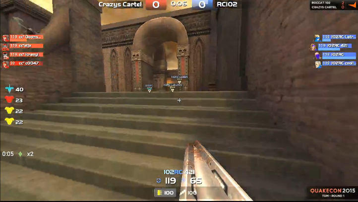
Pleasantly surprised with the new spec-hud, it's finally looking how it should. (Almost perfect even.)
However...

HUD:
<top of the screen>
- bigger clock
- team-names colored according to team_color
- maybe put a border around the score of the team in the lead

<team overlay>
- bigger text
- remove background (just keep health/armor bar)
- remove head-icons (just keep pu icons)
- color names according to team_color (if readability remains ok)
- I don't like how the name jumps out when the player is on pov, not really needed, I think better might be to make the text a bit bigger or bold or underline

<bottom of the screen>
- much bigger name & color according to team_color
- bigger health/armor values
- remove background from ammobar (this might be useful as a player, but is not needed for a spectator and actually draws attention to the weaponbar, which is the least important item in this area)

CONFIG
- transparent gun-model (very important with this hud layout)
- force enemymodel green (using teamcolor for player models may seem more logical, but it's actually more confusing for the spectator because the pov changes constantly from team to team and it's not always clear if the other players are enemies or teammates)
- yellow cross-hair
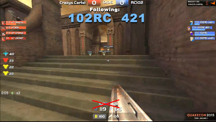
- no follow killer

And this is debatable but:
- picmip 16
(My philosophy is: show the game as close as possible to how it looks for people who play. Showing eye-candy that anybody who is the least bit competitive switches off is a form of false advertising. It will also make the stream more smooth and fluent.
But I can live with picmip 0 because some maps really do look too ugly with high picmip and have overbright problems.)
<< Comment #24 @ 10:26 CDT, 24 July 2015 >>
(Link, Reply)
By ._o filo  - Reply to #1
Just trying to highlight where you kicked in the dark :)

No need to extra define who is in the lead read the numbers, they are there just for that reason.

transparent gun model isnt stream/new viewer friendly, they will go wtf is this plastic bottle gun.

If no follow killer, to whom will you switch to then? ... its is logical to switch to killer.

Changing to skin to sport would be way more better then yours proposition or current setting

Bigger teams overlay i agree and remove head-icons
<< Comment #25 @ 10:44 CDT, 24 July 2015 >>
(Link, Reply)
By esr daytripper  - Reply to #24
No need to extra define who is in the lead read the numbers, they are there just for that reason.
This is no biggie, but a border around the leading score would make it easier so that you can check it with the flick of an eye. I'm watching the action, not the score all the time.

transparent gun model isn't stream/new viewer friendly, they will go wtf is this plastic bottle gun.
Non transparent gun model blocks the other information in that area, you can see it in the screenshot and it's even much worse live because everything is moving very fast and non-stop. Which is also why pretty much all the text needs to be bigger.

If no follow killer, to whom will you switch to then? ... its is logical to switch to killer.
Switch to whoever is most relevant, and that is certainly not always the last killer. For example they could switch to the player with the biggest stack, especially now that they have that information on-screen for both teams. Or don't switch at all, non-stop pov switching is annoying, especially in long matches and long events.

Changing to skin to sport would be way more better then yours proposition or current setting
I disagree, for the reasons I already mentioned. Also most streams that I have ever watched use force enemymodel green and that works just fine.
Edited by daytripper at 10:46 CDT, 24 July 2015
<< Comment #2 @ 18:20 CDT, 23 July 2015 >>
(Link, Reply)
By modem - by sampo 7ep3s 
-perhaps pickup messages from bottom left could be moved more towards the centre

-followed player's health/ammo was just totally invisible sometimes thanks to certain gunmodels and powerup glows, weapon bar also suffered the same to some extent

-bigger team overlay pls (btw would it show what kind of armor is worn by players when tiered armor is on?)
<< Comment #3 @ 18:29 CDT, 23 July 2015 >>
(Link, Reply)
By nvidia atfab 
almost perfect

minor suggestions though:

-change the blue vs red teams to light blue vs yellow green (blue vs green) for better visibility

-increase the size of player names


that is all
<< Comment #4 @ 18:30 CDT, 23 July 2015 >>
(Link, Reply)
By Croatia Venser 
Much bigger player name. The black transparent box of the weapon bar should be colored red or blue according to the team so it's immediately clear what team you're watching. The side player health bars should be bigger. It's hardly readable when not in fullscreen on Twitch. There should be an icon of a weapon equipped on these sidebars.The head models on the right should be on the other side, on the edge of the screen.
Edited by Venser at 18:37 CDT, 23 July 2015
<< Comment #6 @ 19:25 CDT, 23 July 2015 >>
(Link, Reply)
By France imdaniel 
Almost perfect, just need to color the player we are following HP and ARMOR font with the color of its team more clearly.

I would like for CTF to be able to force my team's base color, i get confused sometimes and don't know if i am blue or red. I guess this would need a new texture propriety.
<< Comment #8 @ 20:41 CDT, 23 July 2015 >>
(Link, Reply)
By ql Yakumo  - Reply to #6
that's what

cg_forceTeamModel "crash" // (or set to another, or leave blank if you want, all models have bright skins)
cg_forceTeamSkin "bright"
cg_forceTeamWeaponColor "0" // 0 or 1 to override players chosen rail colours.
cg_teamUpperColor "0xff00ffff"
cg_teamLowerColor "0x800080ff"
cg_teamHeadColor "0x800080ff"


are for (or use the in game advanced menu)
<< Comment #5 @ 19:15 CDT, 23 July 2015 >>
(Link, Reply)
By Austria r34Lh4t3 
minor things that should change

but already big step forward for fps/arena shooters world domination
<< Comment #7 @ 19:40 CDT, 23 July 2015 >>
(Link, Reply)
By Italy qwih 
agree that this is mostly great. Make the names and health\armor more visible, add an icon for the weapon in use by the player. Maybe also the position?
Edited by qwih at 19:41 CDT, 23 July 2015
<< Comment #9 @ 21:14 CDT, 23 July 2015 >>
(Link, Reply)
By boatclub palatka 
massive improvement over the previous
<< Comment #10 @ 22:15 CDT, 23 July 2015 >>
(Link, Reply)
By shaftwhores only by [EXE]dann lithz 
Make the boxes a little bigger so you can see the full name and as someone else mentioned, maybe a weapon icon near the name.

Make it show health AND armour values - 100/100. Could use the current armour bar system for the health too, where the background disappears and it'll just show the name. The player's model is cool but not necessary if it needs to be removed for the current weapon in use if there isn't enough space.

There'll need to be room for bigger names anyway since people will be tagging up with steam nick names and full clan tags instead of abbreviations. (e.g. ROCCAT.102 Latrommi)
Edited by lithz at 22:16 CDT, 23 July 2015
<< Comment #11 @ 23:03 CDT, 23 July 2015 >>
(Link, Reply)
By United Kingdom vanqu1sh 
Make the playername larger, and maybe colour it with a semi-transparent background that corresponds to the colour of the team the person is playing on. other than that, seems fine
<< Comment #12 @ 00:17 CDT, 24 July 2015 >>
(Link, Reply)
By Apple Mac magadog 
Edited by magadog at 00:19 CDT, 24 July 2015
9%
<< Comment #13 @ 01:09 CDT, 24 July 2015 >>
(Link, Reply)
By Canada FlashSoul  - Reply to #12
Just why? I mean, I guess it could be bigger but why this big? It's an information you don't need to constantly see. It's true that the POV keeps switching with the way casting is handled but that's not how spectating usually works.
8%
<< Comment #15 @ 02:15 CDT, 24 July 2015 >>
(Link, Reply)
By Apple Mac magadog  - Reply to #13
That's how big they were on quake 3 and it was fine. You shouldn't have to labor to find out who you're watching and what color they are. The pov switches very fast, and you miss action when your trying to read a tiny little name on the bottom. And a lot of times the pov changes and you don't even realize you're watching someone different for a while.

This way you always know and your peripheral vision can basically id the name and team without even looking at it. It's functional. The clan name really doen't even need to be there but I put it up there anyway.
Edited by magadog at 02:16 CDT, 24 July 2015
<< Comment #16 @ 02:22 CDT, 24 July 2015 >>
(Link, Reply)
By Apple Mac magadog  - Reply to #15
If you make the letters a little less tall and a bit less bold and get rid of the clan name it'd probably be better. But even as big as I made it, it wouldn't get in the way. I know cause in quake 3 it was never a problem.

The score board was better too (for playing), cause you could see who killed you and where they were and what happened.

Quake Live you just die and a big scoreboard pops up and esp if you're a newb you have no idea wtf happened.

https://www.youtube.com/watch?v=FgSNy-2rAFo
Edited by magadog at 02:26 CDT, 24 July 2015
<< Comment #17 @ 05:36 CDT, 24 July 2015 >>
(Link, Reply)
By Croatia Venser  - Reply to #12
Make it a bit smaller but that's the right spot.
Edited by Venser at 05:36 CDT, 24 July 2015
<< Comment #14 @ 02:09 CDT, 24 July 2015 >>
(Link, Reply)
By Germany - Bayern mouse* 
The colours indicating health are not clear enough and the name of person followed is not big enough. I watch in medium quality windowed and I have to look hard to identify whose pov it is.
<< Comment #22 @ 09:10 CDT, 24 July 2015 >>
(Link, Reply)
By cooller skint  - Reply to #14
I'd recommend better internet mate.
<< Comment #18 @ 07:27 CDT, 24 July 2015 >>
(Link, Reply)
By Serbia bogOtac 
I hope the hud has EBASHIM and SPIZDILI written for CTF
<< Comment #34 @ 17:50 CDT, 24 July 2015 >>
(Link, Reply)
By frozen Freiya  - Reply to #18
For sure.


Whatever the fuck they are. : D
<< Comment #19 @ 07:32 CDT, 24 July 2015 >>
(Link, Reply)
By lolfly lol frs 
- team overlays larger

- larger and team colored health/armor/name of the player being followed

- small weaponbars for players in the team overlay

- get rid of the xxx picked up quad/red armor/mega health/etc text, instead pop up the name next to the item being picked up in the timing list.

- add a bar below the items in the item timing list, for example 5 small boxes. each box is either red or blue according to the team. the boxes show item control cycles, ie. if its 5 small red boxes, red team has had the last 5 item pickups.

- add rg/lg atleast to the item timing list for tdm

- add a number for armor in the team overlay bar.

- streamer specific: get rid of followkiller most of the time, actually learn to spec.
22%
<< Comment #23 @ 09:14 CDT, 24 July 2015 >>
(Link, Reply)
By Plusme ins  - Reply to #19
+5000 to streamer specific
14%
<< Comment #20 @ 07:55 CDT, 24 July 2015 >>
(Link, Reply)
By Poland fau 
- Weaponbar or just current weapon in team overlay (instead of skin icon).

What are these stars above teammates though? Green bar is health I guess?

edit: Also I fucking love fov switching. Watching cooller zoom rail is so much fun. Wish someone with fov 69 was playing for extra lols :D
Edited by fau at 07:57 CDT, 24 July 2015
<< Comment #21 @ 09:04 CDT, 24 July 2015 >>
(Link, Reply)
By Poland SSRI 
I think that designing an HUD that contains everything of interest, is visible and doesn't obstruct most of the screen will prove to be impossible. An approach from starcraft 2 where the observer can bring up a graph with the appropriate statistic for a while would be much better in my opinion.

Item timers should include weapons in tdm and could be extended with a bind to show a graph with a timeline on which red and blue colors indicate which team had taken the item. At the end of the graph the percentage of total pickups could be displayed (red 0.62, blue 0.38).

Team overlays with weapon bars for each player would probably be too big but if you could extended them just for a moment with a bind to check who has the most weapons you could then go spectate them. It would be also useful for illustrating the bad position of a team that was all-killed by a quad run and is running around with machine guns.

A lot of new possibilities would be opened with this approach.

I agree that bots being colored by team rather than the regular bright green is confusing. "OMG WHY DON'T YOU SHOOT HIM! SHOOT HIM! GOD DAMNIT...oh.. oh ok, he's your teammate" - me most of the time.
<< Comment #26 @ 10:53 CDT, 24 July 2015 >>
(Link, Reply)
By United Kingdom Disrepute 
Can't agree with this sudden hatred of follow killer. Its a good base line spectator tool and SHOULD find players automatically in the attacking or better equipped position.

Lets ignore telling people to turn that off and simply tell the streamers to think about who they follow a little more. Switch at appropriate times and to the best positioned players.

But also cycle through teams to get an overview of positions.
<< Comment #28 @ 11:35 CDT, 24 July 2015 >>
(Link, Reply)
By esr daytripper  - Reply to #26
Its a good base line spectator tool and SHOULD find players automatically in the attacking or better equipped position.
With the new hud and functionality it's much easier to find and switch to the player with the biggest stack (for example), and that's not necessarily the last killer as he was just in a fight.
<< Comment #27 @ 11:25 CDT, 24 July 2015 >>
(Link, Reply)
By esr daytripper 


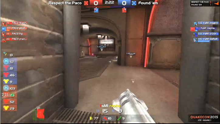
Wouldn't it be less confusing if the moving flags (up top under the scores) never switched color?
Edited by daytripper at 12:06 CDT, 24 July 2015
<< Comment #31 @ 12:27 CDT, 24 July 2015 >>
(Link, Reply)
By esr daytripper  - Reply to #27
Here's an idea:

- move the flags as indicated
- keep the standard flag icons as before update
- make flags bigger
- they never change color

- when flag is moving put a grey box in original position to indicate it's been stolen (this just feels more intuitive)
Edited by daytripper at 00:40 CDT, 25 July 2015
<< Comment #29 @ 11:47 CDT, 24 July 2015 >>
(Link, Reply)
By lolfly lol frs 
for tdm:

- add small stats in the teamoverlay for either frags, damage net, damage total or a combination of those for current life. this will easily show everyone who is on a roll and specs can change to him.
<< Comment #30 @ 11:49 CDT, 24 July 2015 >>
(Link, Reply)
By lolfly lol frs 
stuff from http://www.esreality.com/post/2390219/improve...y-project/ (some might actually be implemented now)
Edited by frs at 11:50 CDT, 24 July 2015
<< Comment #32 @ 12:43 CDT, 24 July 2015 >>
(Link, Reply)
By lolfly lol frs 
- add a bar below the items in the item timing list, for example 5 small boxes. each box is either red or blue according to the team. the boxes show item control cycles, ie. if its 5 small red boxes, red team has had the last 5 item pickups.

they could just use the colored background that is already there for ctf items (relating to which side of the map it's on). instead the bar would be multicolored and change based on who has been getting the item.
<< Comment #33 @ 12:58 CDT, 24 July 2015 >>
(Link, Reply)
By lolfly lol frs 
wallhack for specs similar to CS:GO
2%
<< Comment #35 @ 02:53 CDT, 25 July 2015 >>
(Link, Reply)
By Hungary kapca  - Reply to #33
Yea, but not on online servers, because that would mean sharing "sensitive" information with clients who are not on the same team, and the more information you give out, the easier to exploit it.
So perhaps the best would be to have tournament servers, where such information would be sent out to admins and casters to provide better coverage.
<< Comment #36 @ 06:48 CDT, 25 July 2015 >>
(Link, Reply)
By eyeball by hatelul neeple 
I like the changes but it needs:

- colour change depending on what team is being specced
- specced players names should be highlighted instead of indented. I thought the sticking out player name was a bug for a while before I realised it was the player being specced
- for ctf the bar that shows the flag position is really cool, but it might be better to just show a red flag coming from red and blue flag coming from blue.

That way when the red flag is in the blue base you see a red flag all the way over on the blue side of the bar. Whereas now you see a blue icon in the blue base if they have the red flag over there
<< Comment #37 @ 07:29 CDT, 25 July 2015 >>
(Link, Reply)
By anonymous Anonymous (79.210.79.168) 
omg team overlay is too far up, it hurts the eye muscles.
And also too small.

It's a start but far from perfect.
<< Comment #38 @ 08:51 CDT, 25 July 2015 >>
(Link, Reply)
By anonymous Anonymous (79.210.79.168)  - Reply to #37
http://i.imgur.com/UPIooVA.jpg
<< Comment #39 @ 17:30 CDT, 26 July 2015 >>
(Link, Reply)
By 008 darwinsGate 
When will the new spec hud be released?

It's a great improvement.

Or if you already have an account:
 
Read the Posting Guidelines

Non-HTML tags: [b]bold[/b], [i]italics[/i], [u]underlined[/u]
[small]small[/small], [q]quoted[/q], [s]strikethrough[/s]
[url=www.url.com]link[/url] or type www.url.com
[flag=country] (list), [avatar=name] (list)
[map=mapname gamename] (list)
Conceived and created by Sujoy Roy (Legal Notices)
RSS Feed Information, Link Buttons and Banners