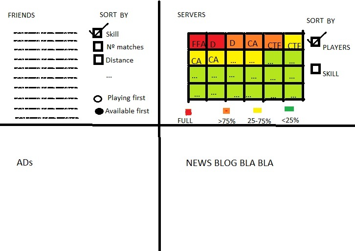
Basically the most important info in my opinion are friends and servers, so theyre at the top. The server list shows all servers, but with smaller icons so they fit all in the window and gives you a bigger idea of the game activity, as you hover it automatically zooms smoothly and you can see more info of that particular server. The friend list is also bigger and has more options to sort.
Its just random thought so you can whine all you want with the many errors it has. Constructive feedback welcome.
Edited by gSTRUCTOR at 22:33 CDT, 24 August 2010 - 2480 Hits

